Design Choices
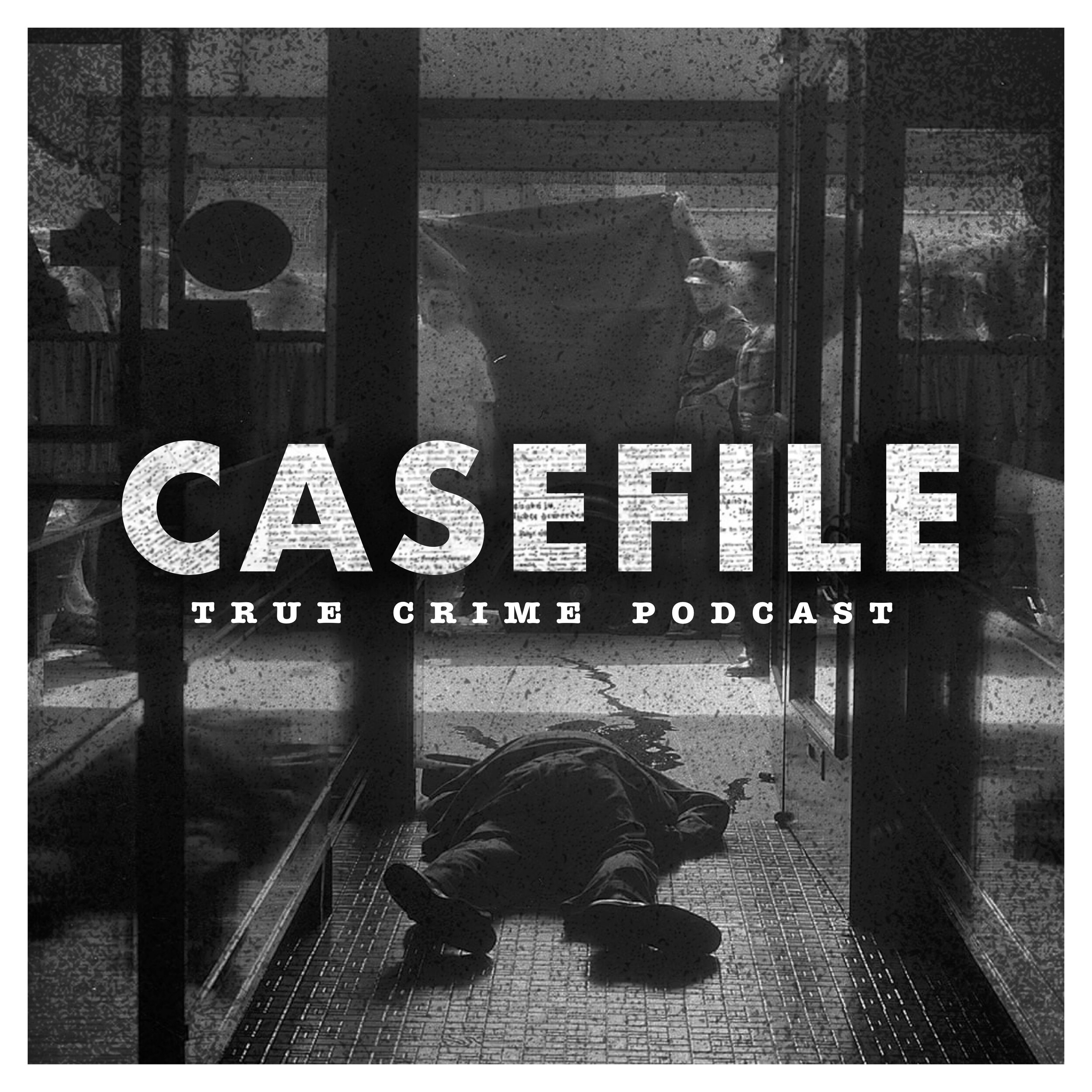
For my design choices, I wanted to lean into the detective and analysis aesthetic present in the tone and content of the podcasts. I choose warm colors to not only stand out among other podcasts but to also give a strong contrast and vintage feel to the designs. Overall, I wanted the composition to feel busy but let the highly saturated twine guide the eye and make it stable once again.
When creating the podcast title page and banner I wanted to capture the detective theme best I could. In order to do this, I started by collecting physical materials from local thrift stores to assemble the detective board. After collecting enough content I set up a small photo booth, assembled the image, and then shot the final image using only real materials.
Casefile Podcast Redesign
Casefile is a true-crime podcast that takes real-world criminal cases, analyzes them, bundles them up, and delivers you a high-intensity and action-filled episode. Each podcast deals with true events and real dangers which is sure to satisfy any thrill-seeker.
Why Use Real Materials?
Case File is a true-crime podcast that takes real-world events, analyzes them, and bundles them up in order to create a high-intensity episode. For this re-brand I tried to capture what Case File does best; By putting you face to face with the crime scene. Creating the detective board physically allowed for a scene of reality to stand out.


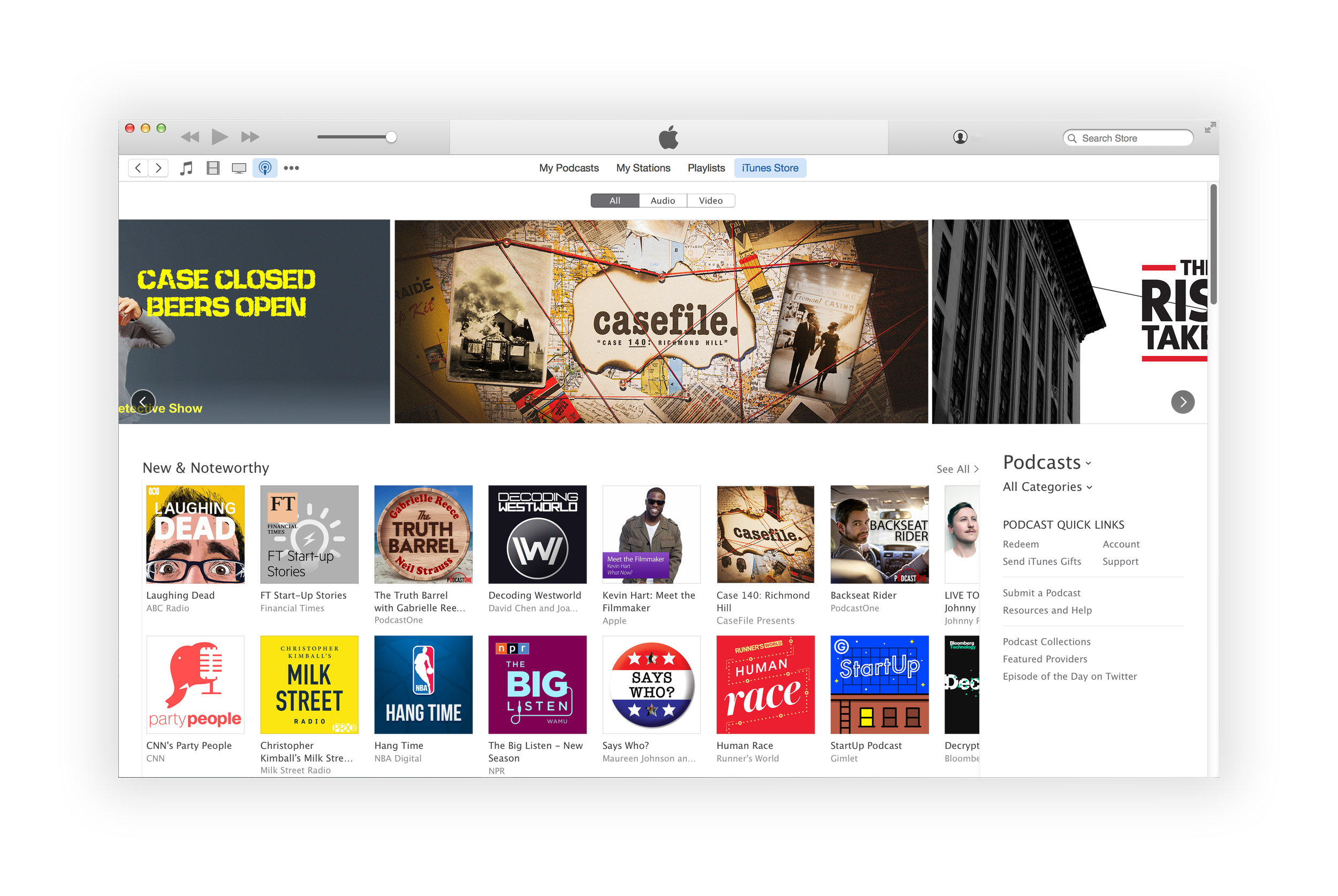
Casefile Style Options